Web Design Standards: Improving UX
When considering websites that do and do not follow the standards and conventions of web design, it is easy to think of polar opposites, and how their meeting, or failing to meet those standards affects the user experience. After viewing the Alexa top sites in the United States, two websites that stuck out to me in particular were Yahoo.com and Google.com. While Google is traditionally thought of more as a search engine than Yahoo, Yahoo is a search engine as well. Both websites provide access to mail, news, videos, weather, and more; however, one site is far more effective than the other. Out of the two, Google creates a better user experience, by following the standards of web design, and creating a comprehensive space for the user to find information with ease.
On webstyleguide.com, Chapter 4, Interface Design explains the importance of organizational context of interfaces. The ‘enterprise interface’ explains that in order to create a successful website, there needs to be organization of the content provided. By creating an identity and uniform style in which the corporation promotes its work, it establishes a comprehensive design that is understood easily by the user. A chaotic design, however, “sends one consistent message about an organization: contempt for the user.” Web Style Guide further explains that coherence, symbolism, and positioning are the aims of a successful enterprise interface. This is where Yahoo and Google come into play.

Upon first glance of both homepages, we can see the significant difference between the two. Above I have provided a screenshot of the Yahoo homepage, as well as the Google homepage. To the right of the Google homepage, I also included a screenshot of the Google menu, which can be seen in the upper right-hand corner of Google’s homepage, and appears as a tiny grid.
While Yahoo chooses to put a little bit of everything on their homepage, Google has made their design simple and classic, using a search bar and a small menu in which you can navigate to all of the same sections that you might be able to in Yahoo. In order to address where they fall in line with the typical web standards, we will evaluate them by comparing them to webstandards.hhs.gov. In Chapter 5: The Home Page, we can see that both websites follow Section 2, Show All Major Options On The Homepage. Each site has a menu of their own, however some of Yahoo’s menu options, such as “Mail” are repeated several different times at the top of the page. Google has a menu as well, however instead of overwhelming the user, they created a grid menu that states concisely the different sections of the website.
In Chapter 6: Page Layout of Website Standards on the HHS government site, Section 1 explains it is imperative to avoid cluttered displays. “Clutter is when excess items on a page lead to a degradation of performance when trying to find certain information. Studies have shown that users can find what they are looking for more quickly in a sparse and uncluttered display than in a dense display. On an uncluttered display, all important search targets are highly salient, i.e., clearly available.” This section also confirms that the use of the simple menu provided by Google has been proven to be more user-friendly. When the user becomes overwhelmed with options, it is hard to find the information they’re looking for, and they quickly become deterred from searching for it.
Chapter 7: Navigation, explains the importance of making the sites navigation simple and straightforward for the user. Because of the cluttered Yahoo’s homepage, combined with the poor use of the menu, navigation becomes more difficult for the user. Section 1 of Chapter 7, also explains the importance of providing navigational options. Unfortunately Yahoo fails to provide any options with navigation, whereas with Google, they provide different navigational and viewing options for the information.
Chapter 16: Content Organization, highlights the importance of organizing information clearly in order to facilitate scanning and ensure that the necessary information is displayed on the website. Because of the lack of organization of content on Yahoo’s homepage, it is hard to scan the different sections in which they tried to highlight. With Google, the user is able to scan easier, as the search provides different viewing methods. These viewing methods include “modern,” “headlines,” “compact,” and “classic” - so that the user can choose the way in which they prefer to scan the information.
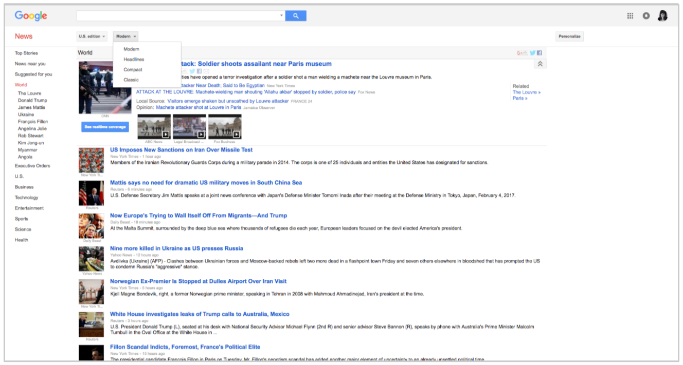
Google also provides a menu on the left in the News section, dividing the news into different categories, so that the user may find what they’re looking for with ease.
When looking at affordances in each website, we also see that Google provides better perceptible affordances than Yahoo. While Yahoo does have a menu that promotes a perceptible affordance, it is still not as clear and concise as the Google drop-down menu. On the contrary, one could say that Google’s use of a grid menu in the right-hand corner could be a hidden affordance. If an older user, not familiar with different menu appearances, did not recognize the grid menu and failed to understand what that meant, it could be less useful as it runs the risk of not being perceived by the user.
In the article “Do Interface Standards Stifle Design Creativity” – Jakob Nielsen argues that even though there are set standards, “no design standard can ever specify a complete user interface. Thus, by definition, much design work remains, even if the designer is committed to complying with the appropriate standards.” By this, Nielsen means that even though there are standards that websites should follow, the way in which the standards are organized can easily be manipulated in a way that allows creativity by the designer. As mentioned in Chapter 4 of Interface Design on Web Style Guide, we can see that Google follow the standards, while also creating a consistent identity for themselves. Google’s identity is based simplicity. Each section of their website, whether its the search engine, Gmail, news, maps, or Youtube – provides an incredible amount of information, in a comprehensive, simple layout. Yahoo however, creates a space of chaos, in which the user is unable to find information.
“The Need For Web Design Standards” by Jakob Nielsen also drives home the importance of the standards and conventions of web design. “Users strongly expect standard elements to work a certain way when they visit a new site because that's how things always work.” By using the standard approach, the website meets the users expectations in a way that enhances their user experience. Google seems to use the standard approach well, while Yahoo falls into the category of convention, or in some cases, even confusion. Yahoo has conventional aspects, like their menu found at the top of their website, however, the lack of content organization leads to confusion by the user.
In conclusion, we can see that by following the standards of web design, Google create a better user experience, as it delivers what user is expecting in a modern, simplified manner. By slacking on some of the standards, Yahoo creates a disorganized website, making it harder for the user to navigate, and find what they are looking for. By implementing web design standards, the designer can make sure that the user is not only content with the aesthetics of the website, but also find what they are looking for with ease.
Works Cited:
"Web Style Guide, Third Edition." Patrick J. Lynch, Sarah Horton. Sarah Horton, Patrick Lynch, n.d. Web. 03 Feb. 2017. <http://www.webstyleguide.com/wsg3/4-interface-design/5-enterprise-interface.html>.
"HHS.gov." HHS.gov. N.p., n.d. Web. 03 Feb. 2017. <https://webstandards.hhs.gov/guidelines/>.
Nielsen, Jakob. "Do Interface Standards Stifle Design Creativity?" Do Interface Standards Stifle Design Creativity? N.p., n.d. Web. 03 Feb. 2017. <https://www.nngroup.com/articles/do-interface-standards-stifle-designcreativity/>.
Neilson, Jakob. "The Need for Web Design Standards." The Need for Web Design Standards. N.p., n.d. Web. 03 Feb. 2017. <https://www.nngroup.com/articles/the-need-for-web-design-standards/>.