Women’s Health Research at Yale
Digital Strategist
At WHRY, I have analyzed objective and qualitative metrics for the center's website. Created research surveys to gather feedback on user’s ease of use and satisfaction interfacing on WHRY’s website. Analyzed survey responses and website analytics to examine high traffic web pages and determine the reason for certain pages outperforming others. Conducted user testing of the center's site and implemented changes based on all research findings. Collaborated with programmers to build out new components. Worked within the confines the CMS to create accessible, intuitive designs. Enhanced user experience by creating seamless navigation.
Manage the content and development of WHRY’s website. Use Google Analytics to identify trends and advance the centers communication plan, leading to a 45% increase of traffic to WHRY’s website. Ensure adherence to Yale University accessibility policies. Review trends in metrics to shape and inform future content development and find areas to streamline flow of information.
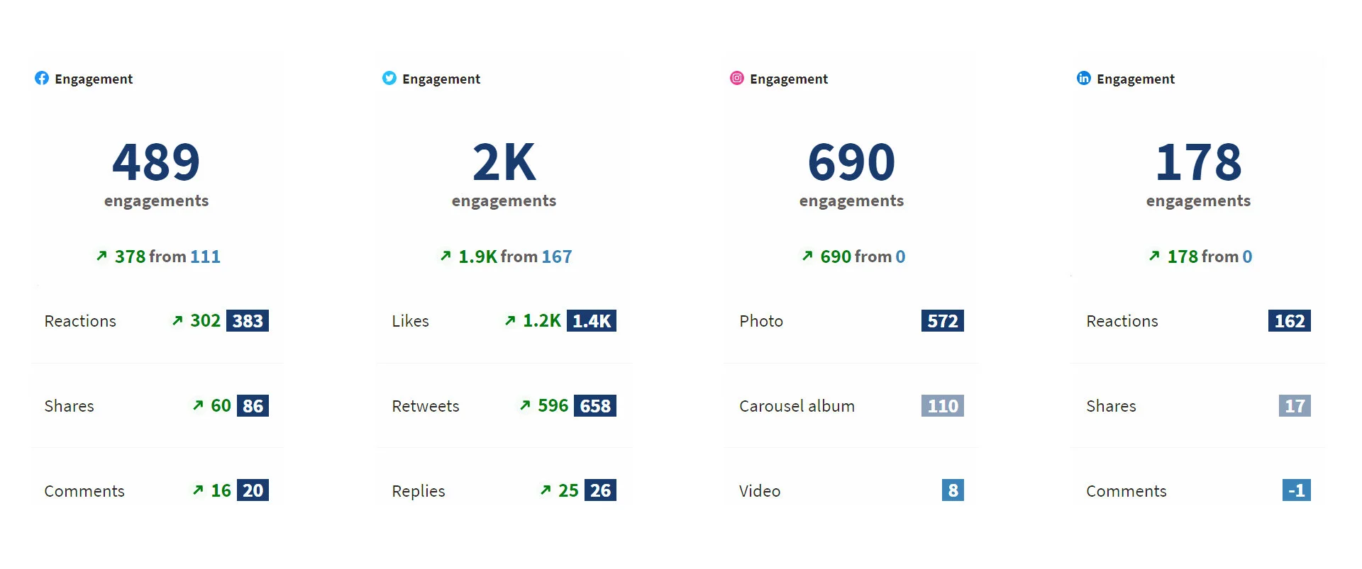
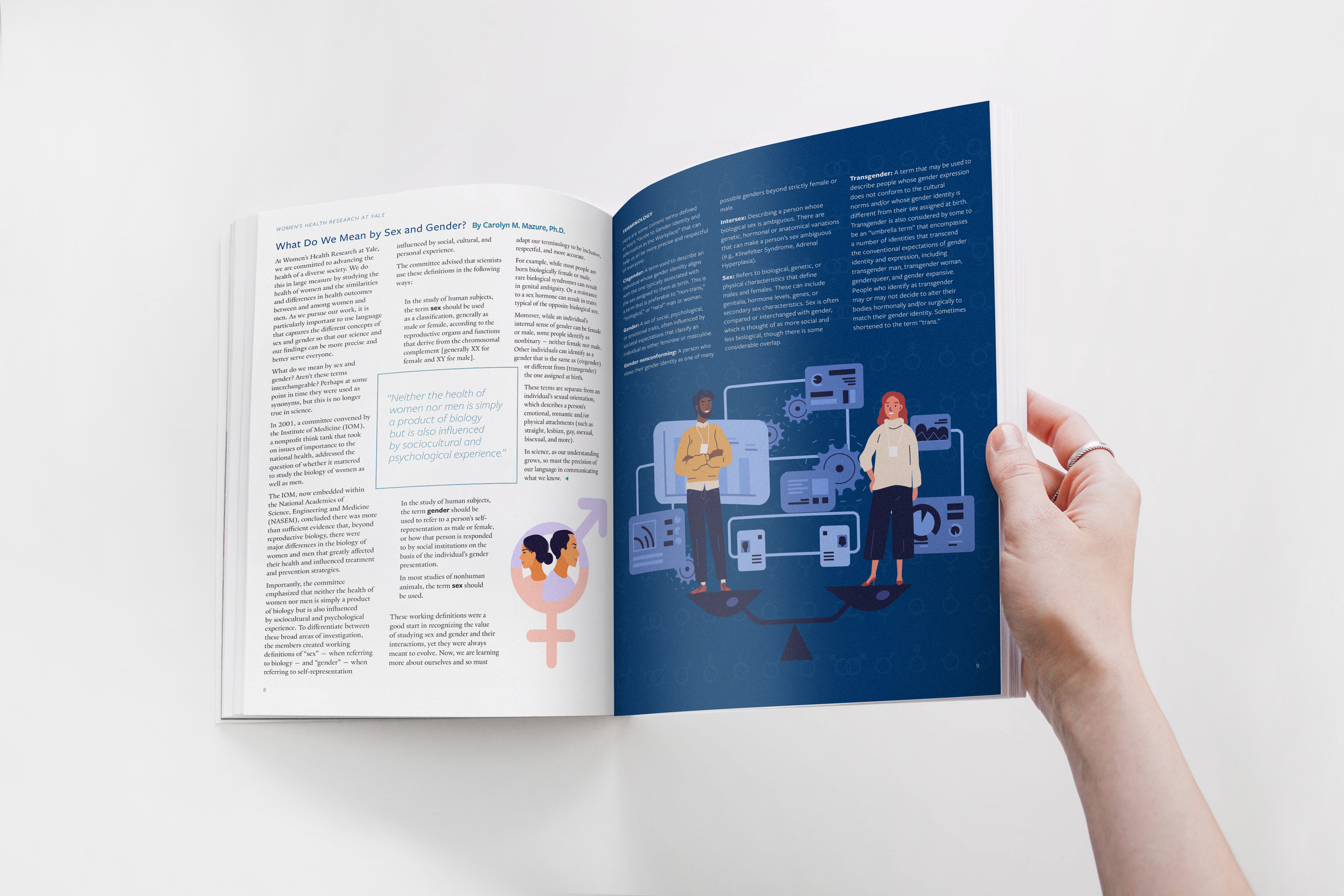
Lead visual design for all digital and print materials. Developed and produce concepts for video/photography. Explain scientific research through visual media. Developed and implemented a comprehensive, diversified Internet presence and social media strategy to advance WHRY’s mission, initiatives, and outreach to various audiences. Increased social media following by 29% and increased engagement by 162%. Provide technical assistance to all staff and council members. Plan, manage, host, record, and edit Zoom Webinars.
Skills Utilized
-
UX & UI Design
-
Social Media
-
Video Editing
-
Print Design
-
Google Analytics
-
Photography
-
Graphic Design
-
Marketing
-
Communications
User Experience Design
Using user research to guide my work, I have made several changes to the WHRY website including improvements to the about page, directors page, integrating a new button component on our news stories, improved SEO, merged pages for clarity and better user flow, and designed a new student blog. These changes have led to a 15% increase in users, 16% increase in sessions, 3% increase in page views, 61% increase in session duration, and 5% decrease in bounce rate.
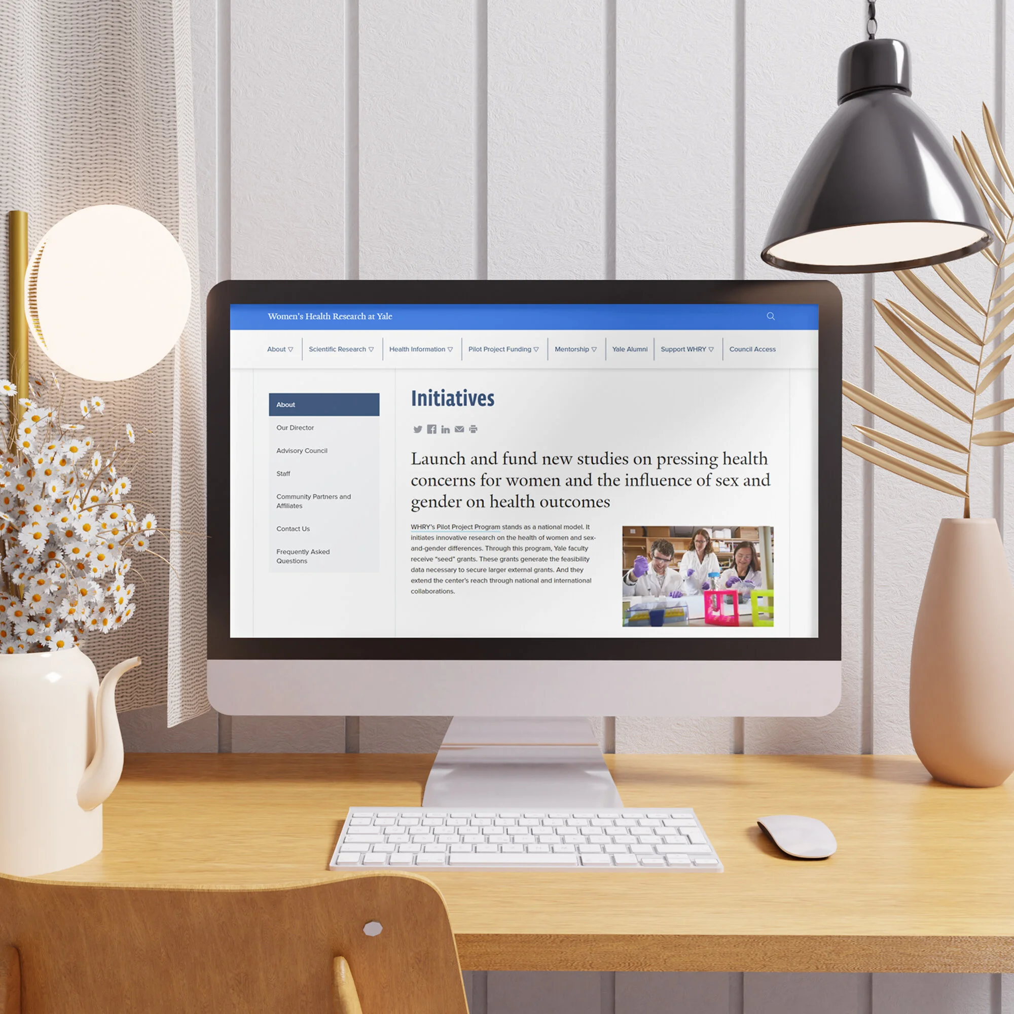
I use google analytics to study the usage of our website, including where our users are coming from and which pages are most frequently visited. What I found tells us that our most frequently visited web pages are our about page, our director’s page, and our news stories. In response to this, I have been making changes to our website that support people learning more about us. For example, I have added more information on our about page, including a clearly stated, mission, vision, as well as adding our initiatives and history, which wasn't previously provided.
For our director’s page, I have added a video gallery that has multiple videos of Dr. Carolyn Mazure speaking about WHRY. This allows people to get a better sense of our leader and mission, directly from her, rather than just text.
For our news stories, I worked with Yale School of Medicine to build and integrate a responsive button component that allows users to be pointed to other pages, based on the content of our story. For example, our philanthropy columns will feature a button that links to our donations page. I have been measuring our bounce rates as well as our uses time on the page, and since integrating this component, our bounce rate has dropped 13% on news stories while the time on the page has increased 7%.
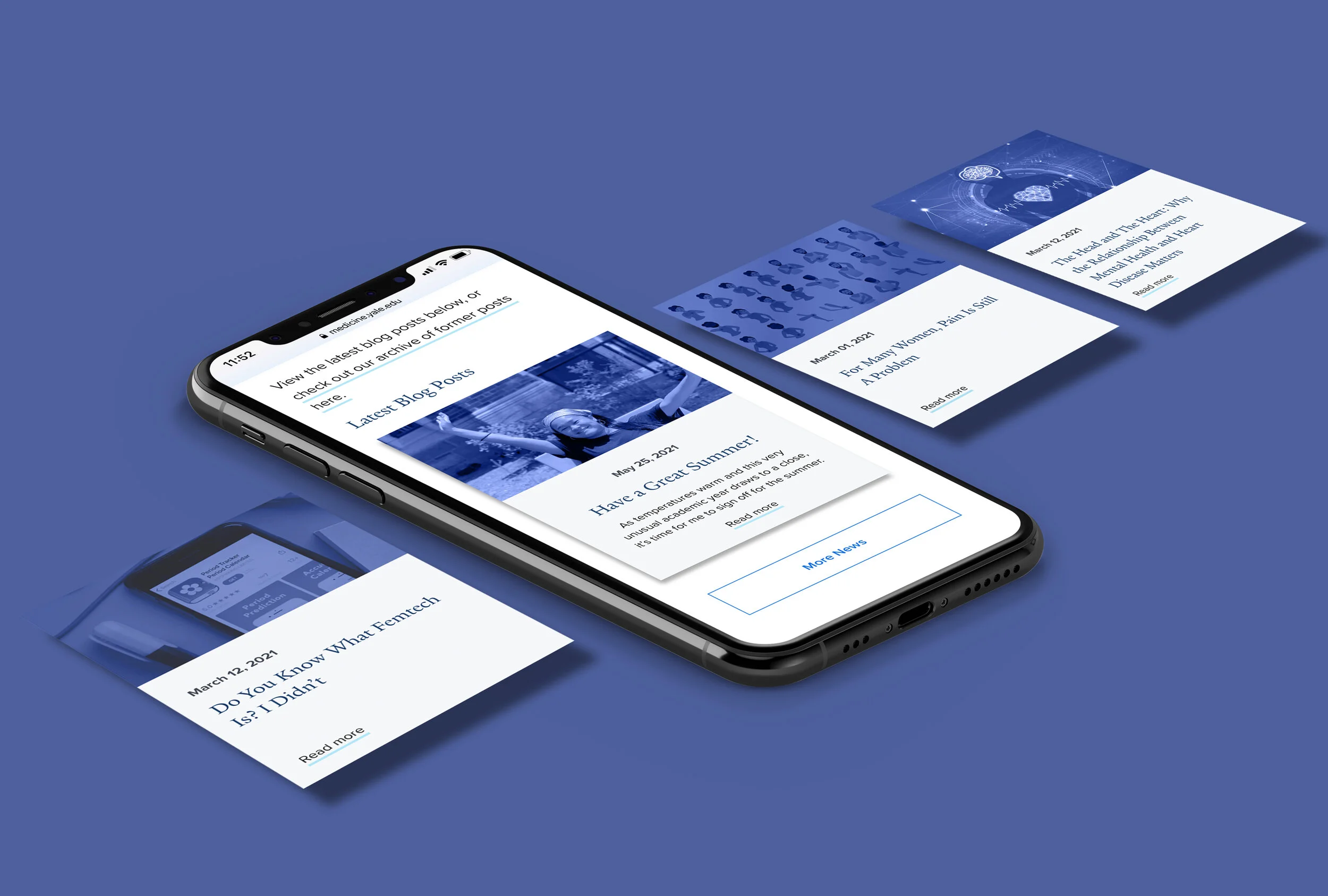
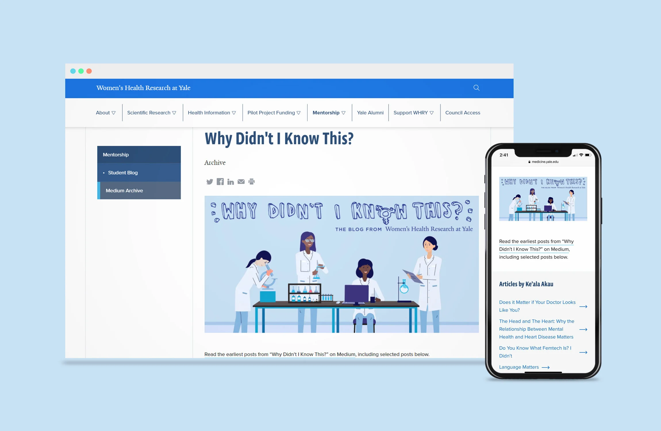
Additionally, WHRY had a student blog that was previously featured on the popular blogging site, Medium. While people were interacting with these posts via social media, the comment features were not being utilized on the blog. To combat this issue and direct more traffic to our website, rather than an external source, I designed a new student blog page hosted right on our site. All new blog posts are featured here, as well as an archive that provides links to the previous Medium posts.
Want to know more about the UX work I’ve done at Yale?
Social Media
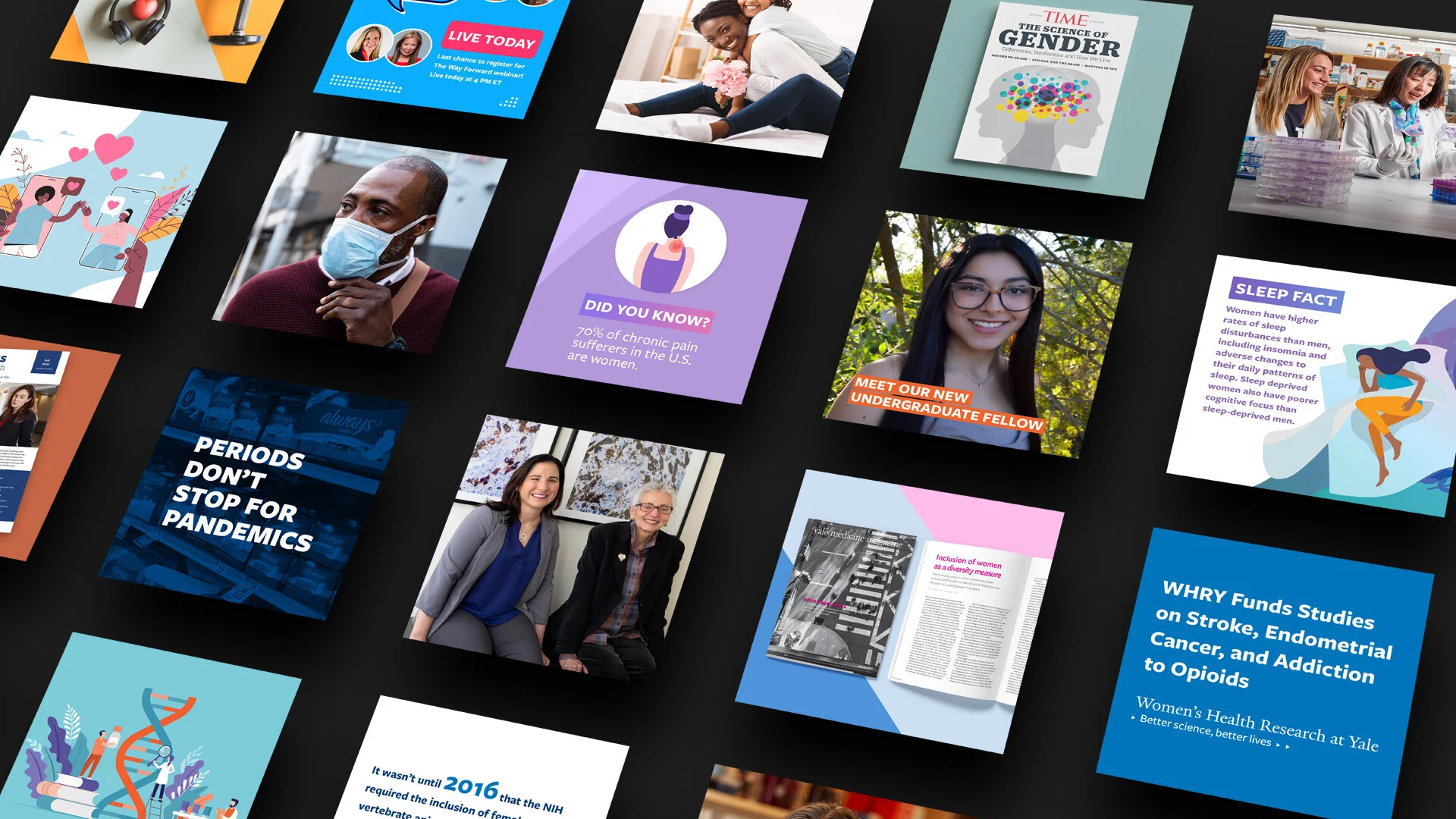
A picture may say 1000 words, but what happens when you need to visualize 1000 words of scientific data and new findings? I am responsible for managing, maintaining, conceptualizing, designing, and writing creative posts for WHRY's forward-looking social media strategy. I work to inform multiple target audiences nationally, regionally, and globally, of complex interdisciplinary scientific information.
The Challenge
The main goal WHRY presented me with upon my onboarding was a need to increase communication between the center and our audiences.
The Process
In order to have a full understanding of where the center stood amongst other organizations at the university, as well as our competitors, I performed a full social media audit and identified the center’s strengths and weaknesses by analyzing metrics on Google Analytics and Hootsuite, as well as our individual social media platforms.
The Solution
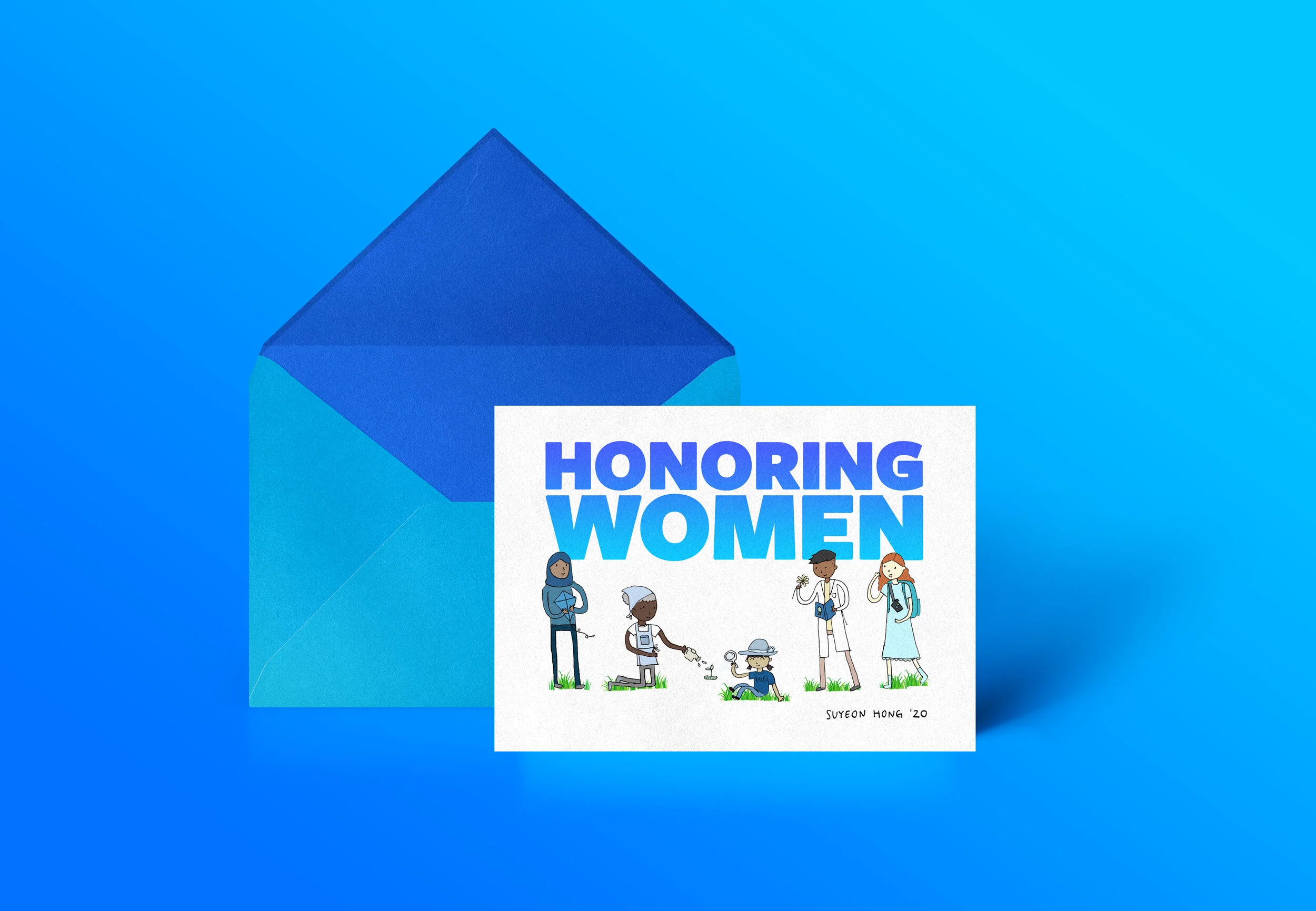
After identifying problem areas, I developed and implemented a comprehensive, diversified Internet presence and social media strategy to advance WHRY’s mission, initiatives, and outreach. I instituted the usage of specific hashtags, tagging colleagues, sharing eye-catching graphics & photographs, as well as gaining new audiences through Instagram and LinkedIn, which the center had previously not been on.
The Outcome
Using the social media strategy I developed, I have increased WHRY’s following on social media by over 33% and increased engagement by 162%.
Video & Photography
Graphics | Color Correcting | Editing
Hosted, Recorded, Managed and Edited ZOOM Webinar | Graphics

