Designing with Grids
Why Design Using A Grid?
Using grid systems in information design has numerous benefits. Over the course of several hundred years, designers have been using grids in order to organize information in a logical and aesthetically pleasing way. By establishing a specific arrangement of the information provided, the designer is able to communicate in a more effective manner.
What makes a grid more effective?
The efficiency of a grid system is a result of several factors. By developing an organized layout, consumers of the information are able to comprehend the material with greater ease. When the designer considers factors such as how the information is grouped together, placed on the page, psychologically and visually registered, they can guide their audience to better understanding.
Layout: Creating Harmony Out of Chaos
When a designer develops a consistent layout in which the brain is accustomed to processing, by means of structuring the information in a harmonious, proportionate design, it helps to successfully translate information to the audience.
Clarity of questions
What I admire most about this design is the clarity of the information provided. Even in a foreign language, the layout of the chart was precise. I could infer from the photographic composition on the top of the design that the data was in reference to a bus line. The photograph of the street complimented the bus line chart as well. In addition, by underlining CDU in black, and Linke in red, the data journalist eliminated the need for a color key. By simply Google Translating “Stimmen der Anwohner entlang der Buslinie M29, in Prozent,” I found that the data translated “vote of local residents along the bus line M29, in percent.” This further clarified the meaning of the data, which I truly appreciated.
Translatability
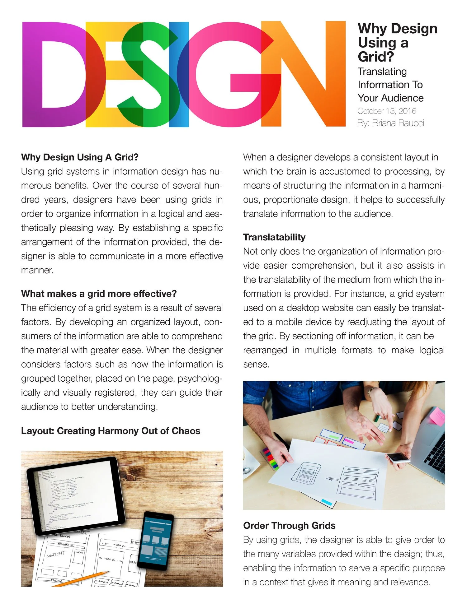
Not only does the organization of information provide easier comprehension, but it also assists in the translatability of the medium from which the information is provided. For instance, a grid system used on a desktop website can easily be translated to a mobile device by readjusting the layout of the grid. By sectioning off information, it can be rearranged in multiple formats to make logical sense.
Order Through Grids
By using grids, the designer is able to give order to the many variables provided within the design; thus, enabling the information to serve a specific purpose in a context that gives it meaning and relevance
