Data Journalisam
Clarity of context and purpose
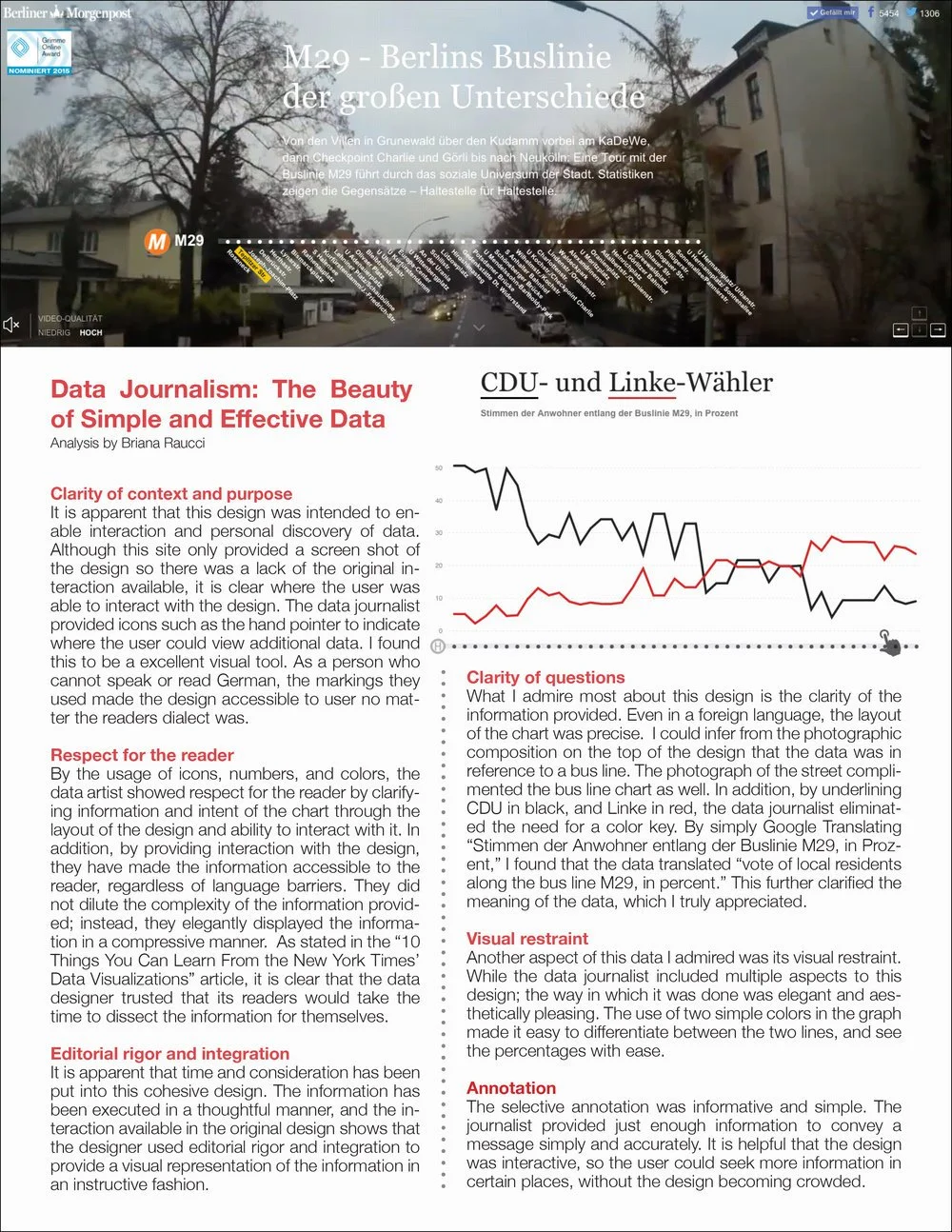
It is apparent that this design was intended to enable interaction and personal discovery of data. Although this site only provided a screen shot of the design so there was a lack of the original interaction available, it is clear where the user was able to interact with the design. The data journalist provided icons such as the hand pointer to indicate where the user could view additional data. I found this to be a excellent visual tool. As a person who cannot speak or read German, the markings they used made the design accessible to user no matter the readers dialect was.
Respect for the reader
By the usage of icons, numbers, and colors, the data artist showed respect for the reader by clarifying information and intent of the chart through the layout of the design and ability to interact with it. In addition, by providing interaction with the design, they have made the information accessible to the reader, regardless of language barriers. They did not dilute the complexity of the information provided; instead, they elegantly displayed the information in a compressive manner. As stated in the “10 Things You Can Learn From the New York Times’ Data Visualizations” article, it is clear that the data designer trusted that its readers would take the time to dissect the information for themselves.
Editorial rigor and integration
It is apparent that time and consideration has been put into this cohesive design. The information has been executed in a thoughtful manner, and the interaction available in the original design shows that the designer used editorial rigor and integration to provide a visual representation of the information in an instructive fashion.
Clarity of questions
What I admire most about this design is the clarity of the information provided. Even in a foreign language, the layout of the chart was precise. I could infer from the photographic composition on the top of the design that the data was in reference to a bus line. The photograph of the street complimented the bus line chart as well. In addition, by underlining CDU in black, and Linke in red, the data journalist eliminated the need for a color key. By simply Google Translating “Stimmen der Anwohner entlang der Buslinie M29, in Prozent,” I found that the data translated “vote of local residents along the bus line M29, in percent.” This further clarified the meaning of the data, which I truly appreciated.
Visual restraint
Another aspect of this data I admired was its visual restraint. While the data journalist included multiple aspects to this design; the way in which it was done was elegant and aesthetically pleasing. The use of two simple colors in the graph made it easy to differentiate between the two lines, and see the percentages with ease.
Annotation
The selective annotation was informative and simple. The journalist provided just enough information to convey a message simply and accurately. It is helpful that the design was interactive, so the user could seek more information in certain places, without the design becoming crowded.