Product Design Solution
A brief overview (for those of you who don’t want to scroll)
-
Sometimes, job seekers want to edit an application after it's already been submitted.
-
Create a “change submission” feature that allows job seekers to edit an application after it’s been submitted.
-
For this personal project, I surveyed family and friends in order to get a small, yet broad range of responses as to how they, as users, would like to edit any job application if given the opportunity.
I had a hunch that most people would choose to edit on desktop, as applying to jobs takes more time and diligence than other mobile activities, however, I wanted to see if that hunch was correct before designing based off of my opinion. I also asked them about features I had in mind, to see if I should integrate them into my solution.
If I were working for the company and faced with this challenge, I would talk to user researchers and collect data on how indeed is truly used before designing a solution.
-
Most users would prefer the feature to be optimized for desktop, the user would want to see their previous submission, and they would not like the changes highlighted for the employer.
-
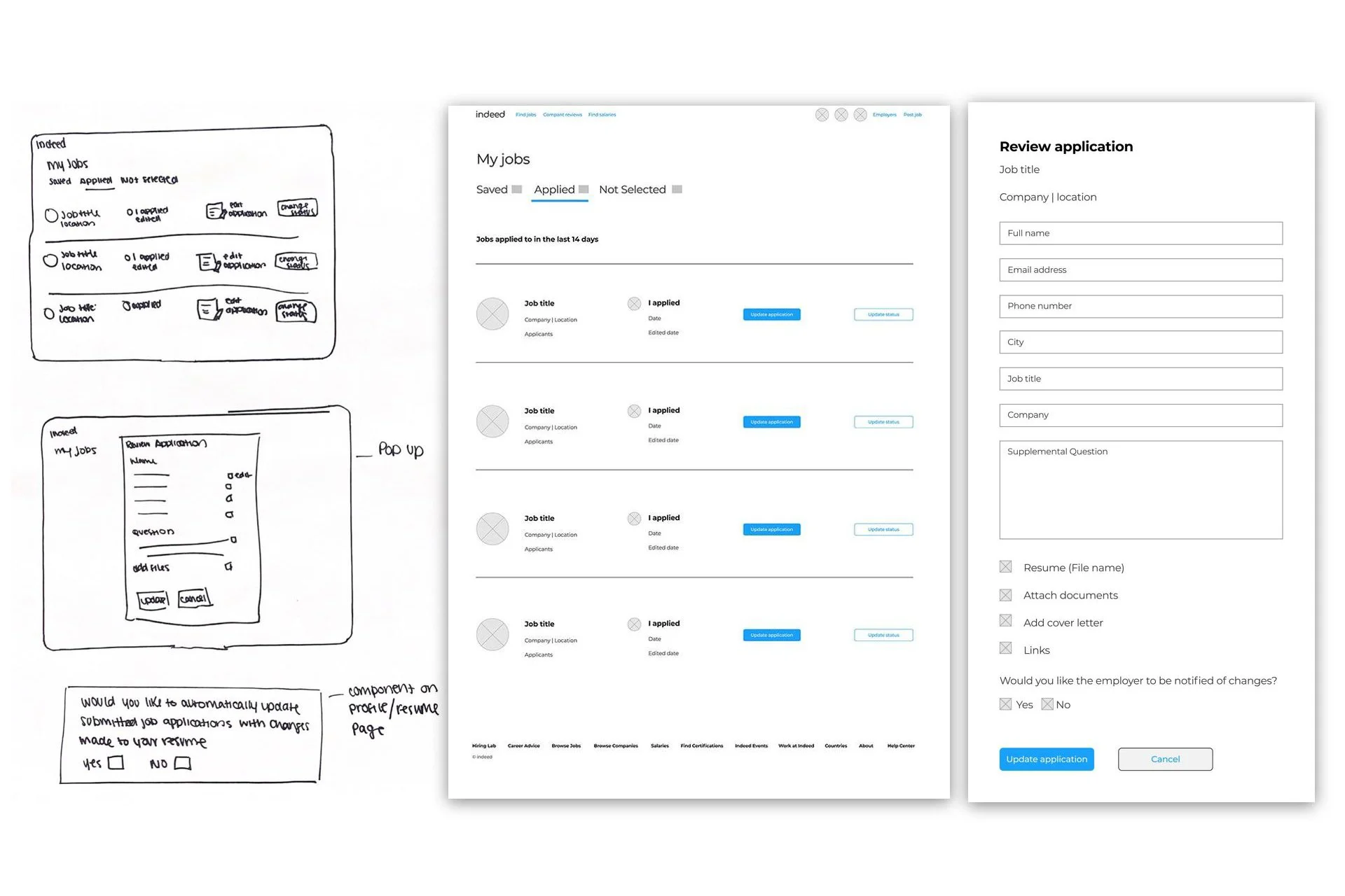
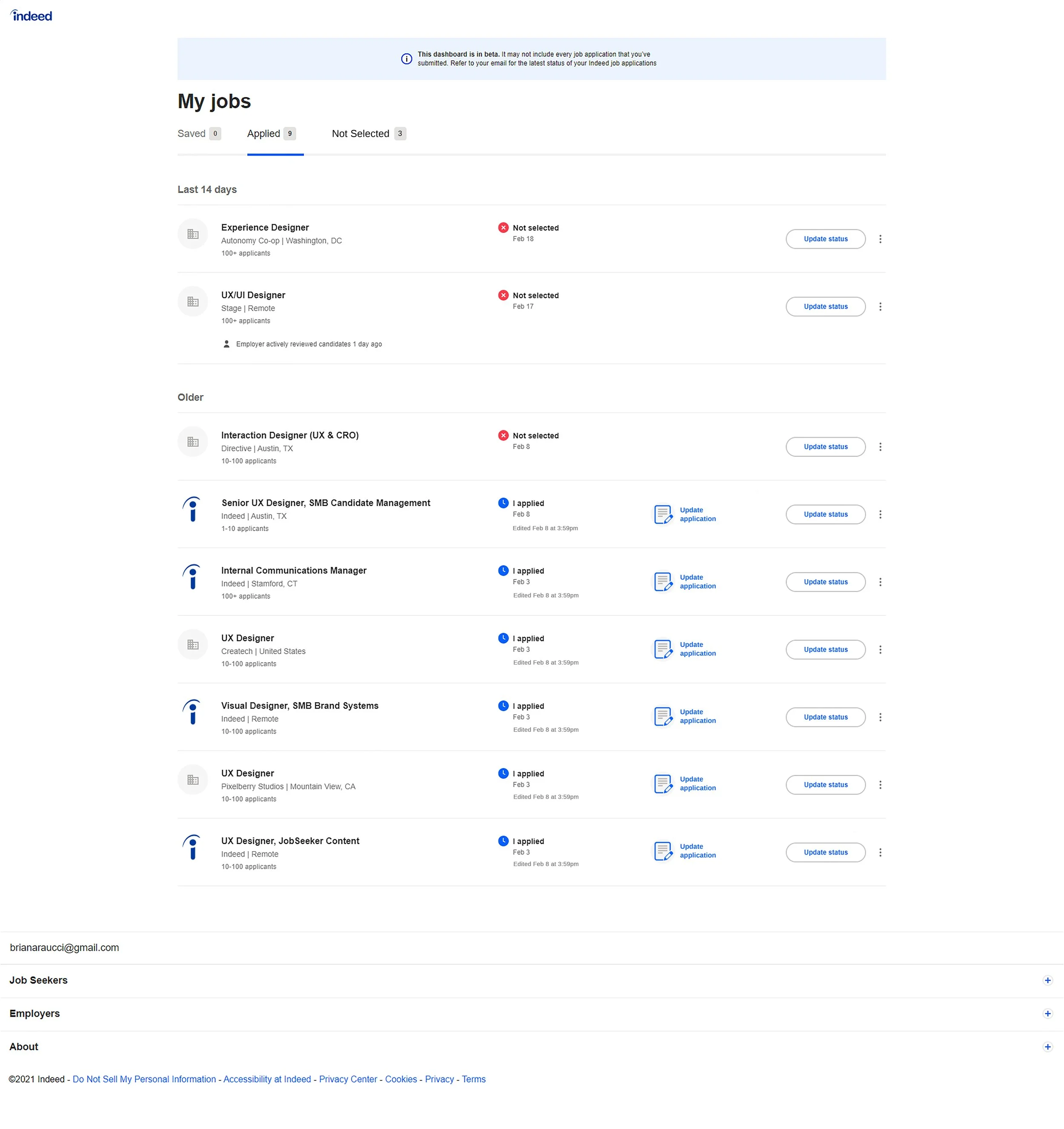
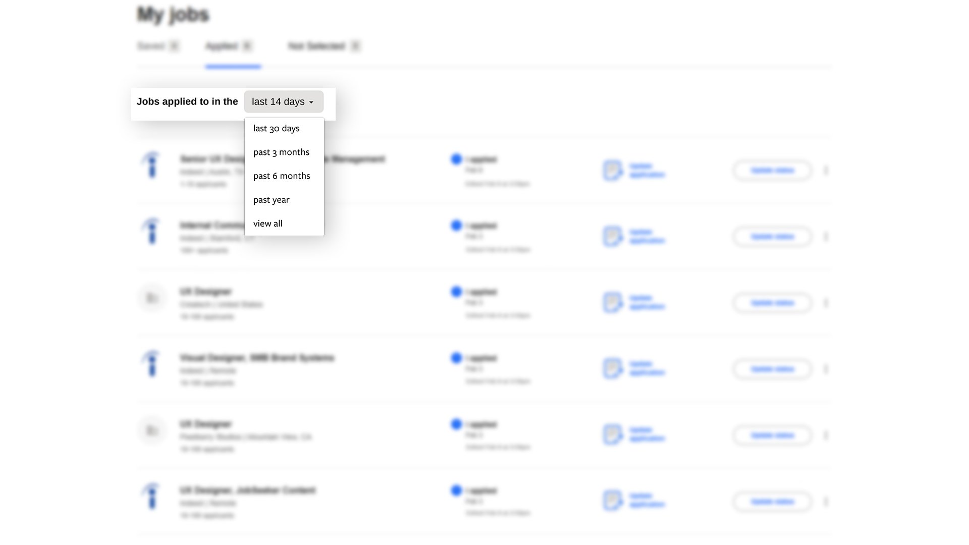
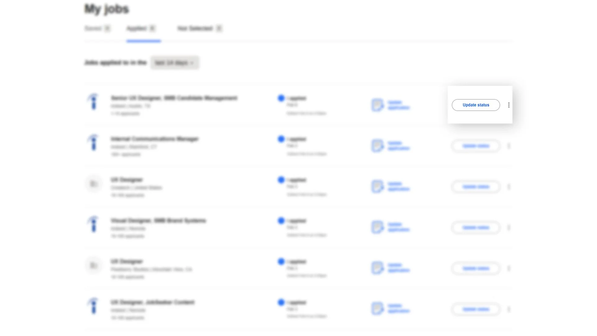
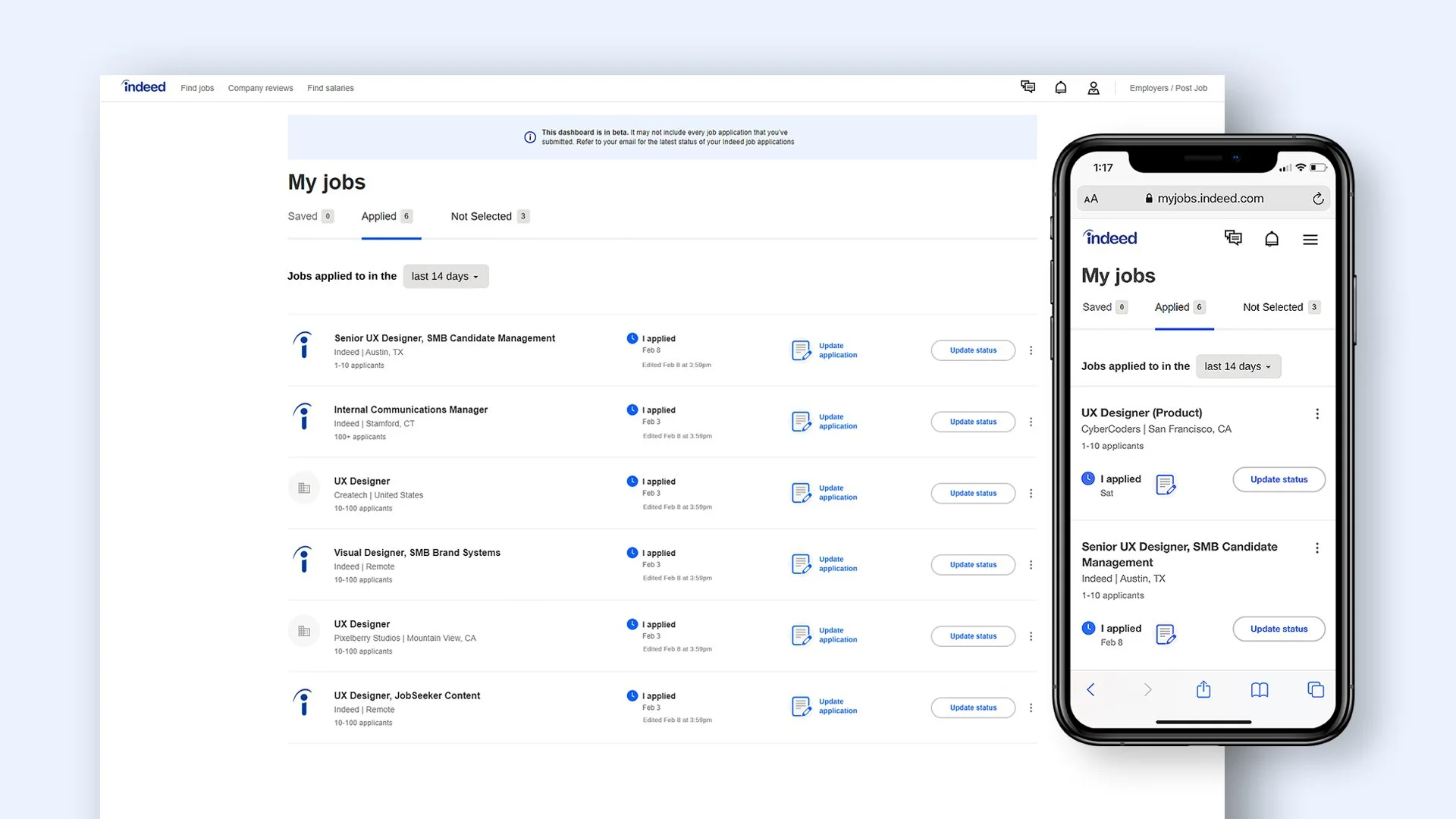
For internal applicants, the new feature would integrate into the current “my jobs” page. An added column would feature a button to “update application,” and upon click, a Review/Edit application pop-up would appear.
For external applicants, when the user clicks the “update application” button on the “my jobs” page, the pop-up would notify the user that the application was submitted externally and cannot be edited through indeed. The pop-up would have a button to “view application on company site.”
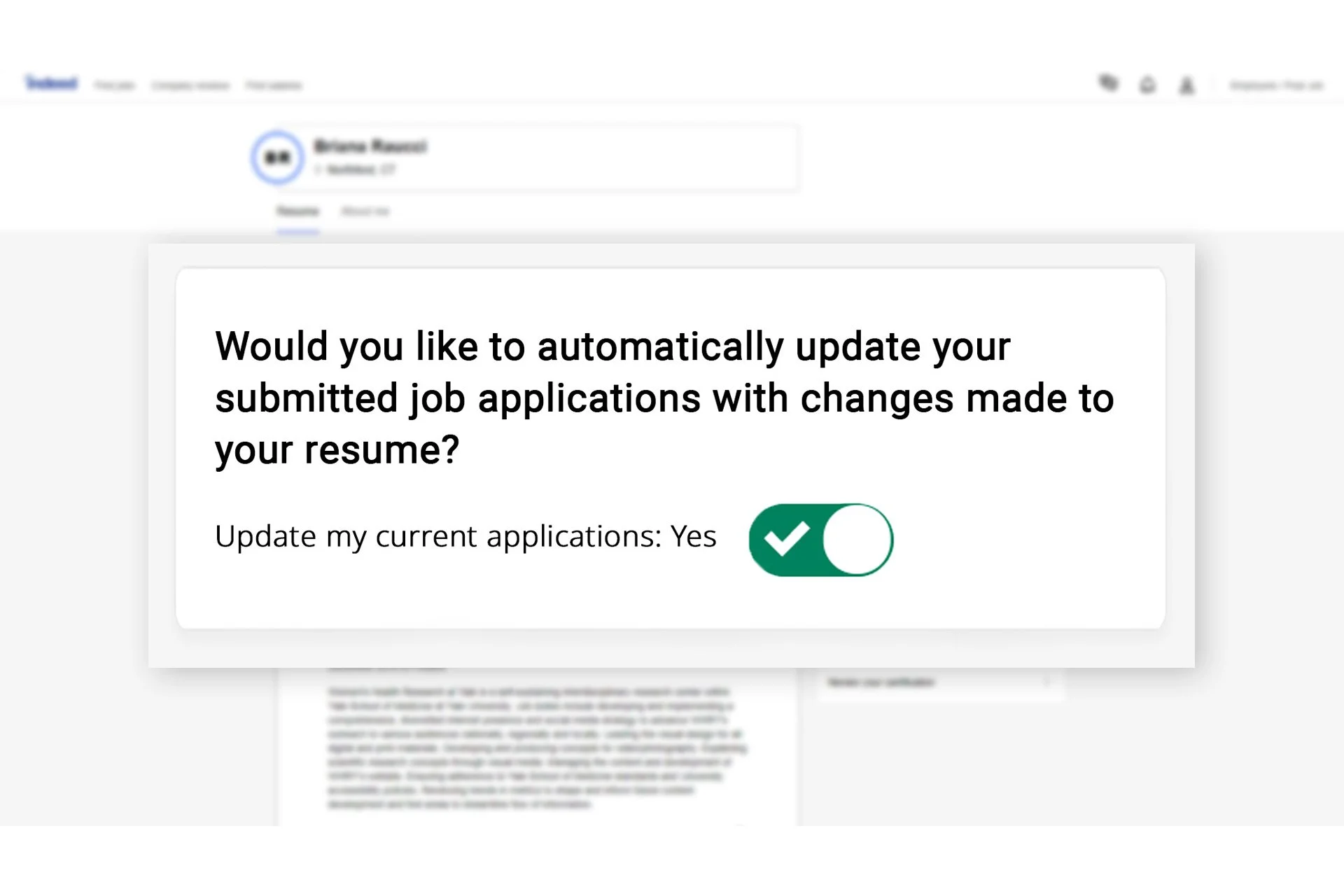
In addition, a Mass Edit component would be built into the profile page. This new component would allow the user to toggle yes or no to the question of, "Would you like to automatically update your submitted job applications with changes made to your resume?" This component would automatically push any changes made to the users profile to all open job applications.
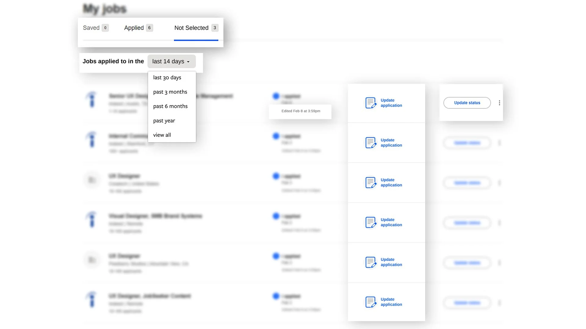
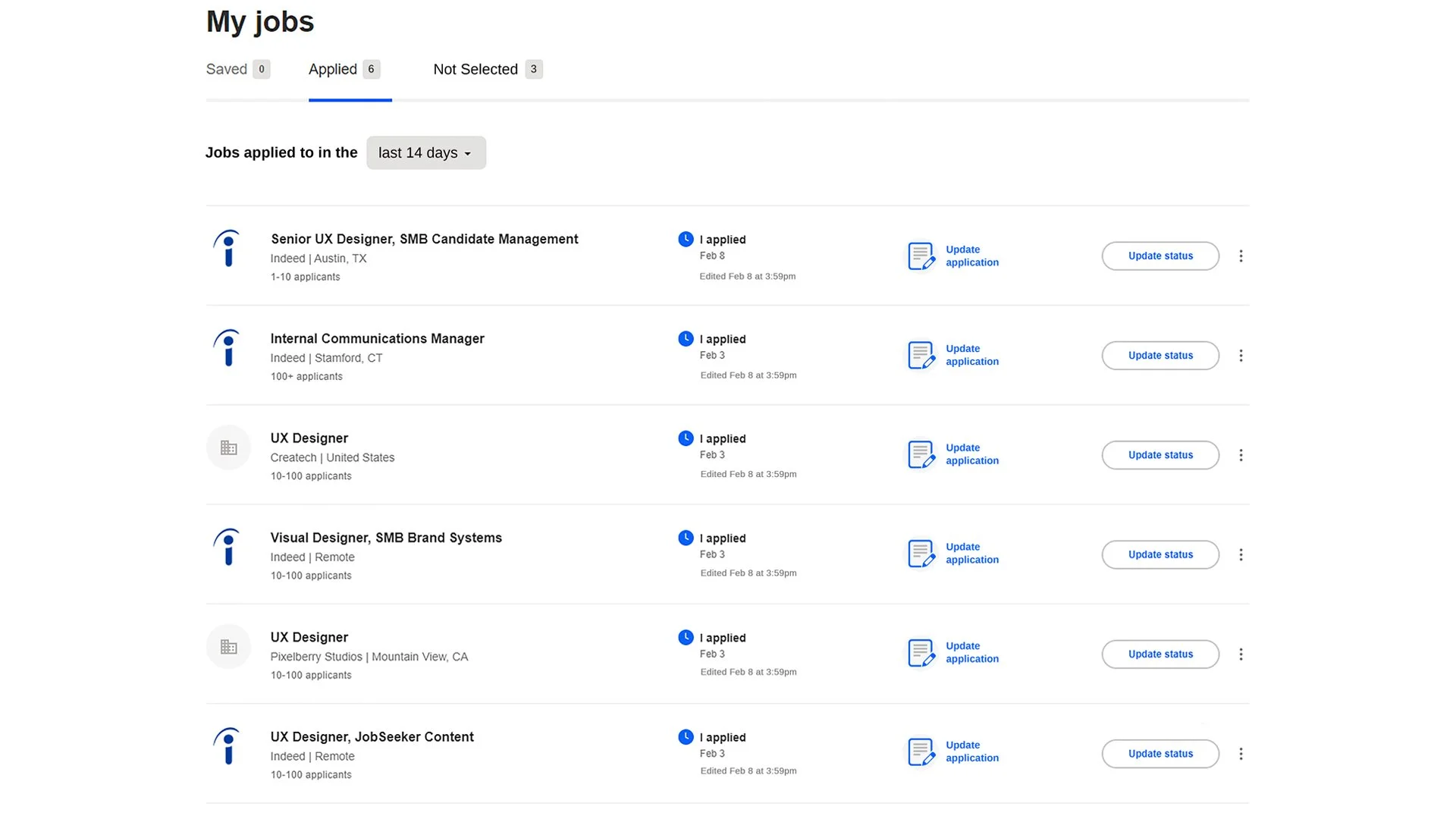
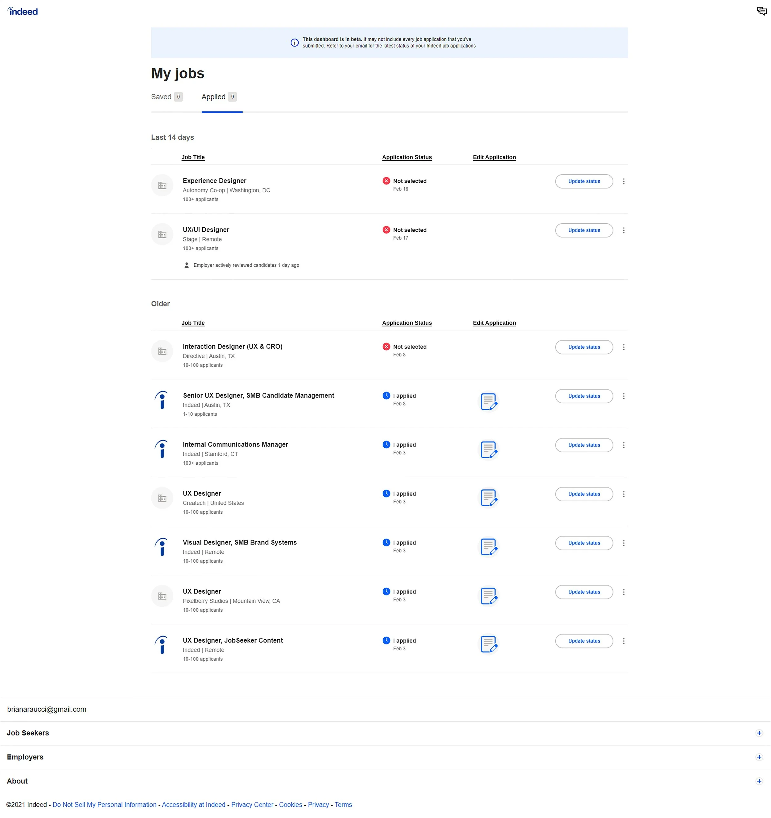
To optimize even further, “Not selected” jobs would be moved to new tab for organizational purposes, as you will not be able to edit these applications. New dropdown will allow users to see some, or all of their open applications. “Edited” timestamp would be added under the “I applied” section, so the user can see time/date of edits, and “Update status” button would be realigned center within its row .
-
Testing would have to be done on icon recognition, button locations, email confirmations, and each feature should be tested extensively.
-
Iterations may include a checkbox feature to select multiple job applications at once. Gamification could also be considered to help show the applicant they are making progress in their job search.
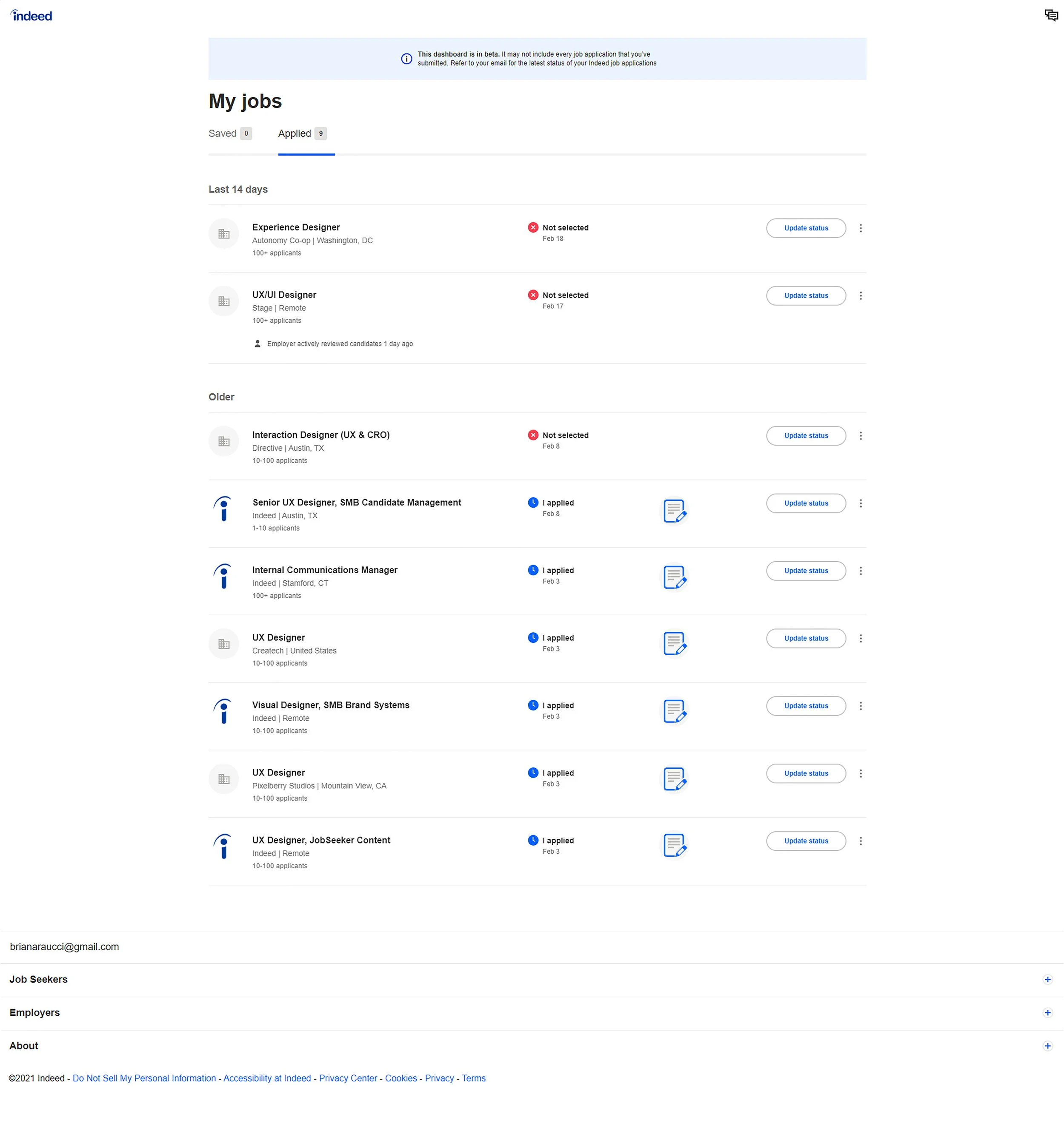
Existing layout
When I started this project, the layout of the “my jobs” page below presented a few issues. There was no way to archive the jobs you had not been selected for, and had you applied to multiple positions, the list could get very long, with no way to condense the time periods.
Hypothesis
I had a hunch that given the opportunity to edit a submitted application, most people would choose to edit on desktop, as applying to jobs takes more time and diligence than other mobile activities, however, I wanted to see if that hunch was correct before designing based off of my opinion.
Research
For this personal project, I surveyed family and friends in order to get a small, yet broad range of responses as to how they, as users, would like to edit any job application if given the opportunity.
If I were working for the company and faced with this challenge, I would talk to user researchers and collect data on how indeed is truly used before designing a solution.
Findings
There were a few findings from my small study:
Most users would prefer the feature to be optimized for desktop
The user would want to see their previous submission
The user would not like the changes highlighted for the employer.
While these features would be optimized for desktop, they could still be integrated into mobile as well. True user research would validate/invalidate the decision to optimize for desktop, and adjustments would be made based on user research. Success would be measured by feature usage, job seeker and employer feedback, and user testing.
Process
Based on my findings, I began creating low and medium-fidelity mockups of the new features I wanted to integrate. I came up with several versions before I began a high-fidelity version.
Iterations
First high-fidelity iteration
Second iteration
Third iteration
Final iteration
New features
Internal Applicants
New feature would integrate into the current “my jobs” page. An added column would feature a button to “update application”. Upon click, a Review/Edit application pop-up would appear.
The pop-up would include all components of the original application, including any supplemental questions. The pop-up would allow users to edit each section, re-upload their resume, attach additional documents & add links.
Additionally, questions at the bottom of the pop-up would allow users to control what the employer sees after altering their submission and receive an email confirmation that the edits were submitted.
External Applicants
When users clicks the “update application” button on the “my jobs” page, the pop-up would notify the user that the application was submitted externally and cannot be edited through indeed. The pop-up would have a button to “View on company site”
This button would bring them to the original link that they were directed to when they applied through the companies website
Mass Edit Component for Profile
This mass edit feature would be added to “Profile” page. The new component would allow the user to toggle yes or no to the question of, "Would you like to automatically update your submitted job applications with changes made to your resume?"
This component would automatically push any changes made to the user's profile to all open job applications.
This improves the user experience, as it allows the user to adjust multiple applications at once. This would reduce the redundancy of editing each individual application.
New Enhancements
Not Selected Tab
On the “my jobs page,” jobs that the user was not selected for would be moved to a new tab for organizational purposes, as you will not be able to edit these applications.
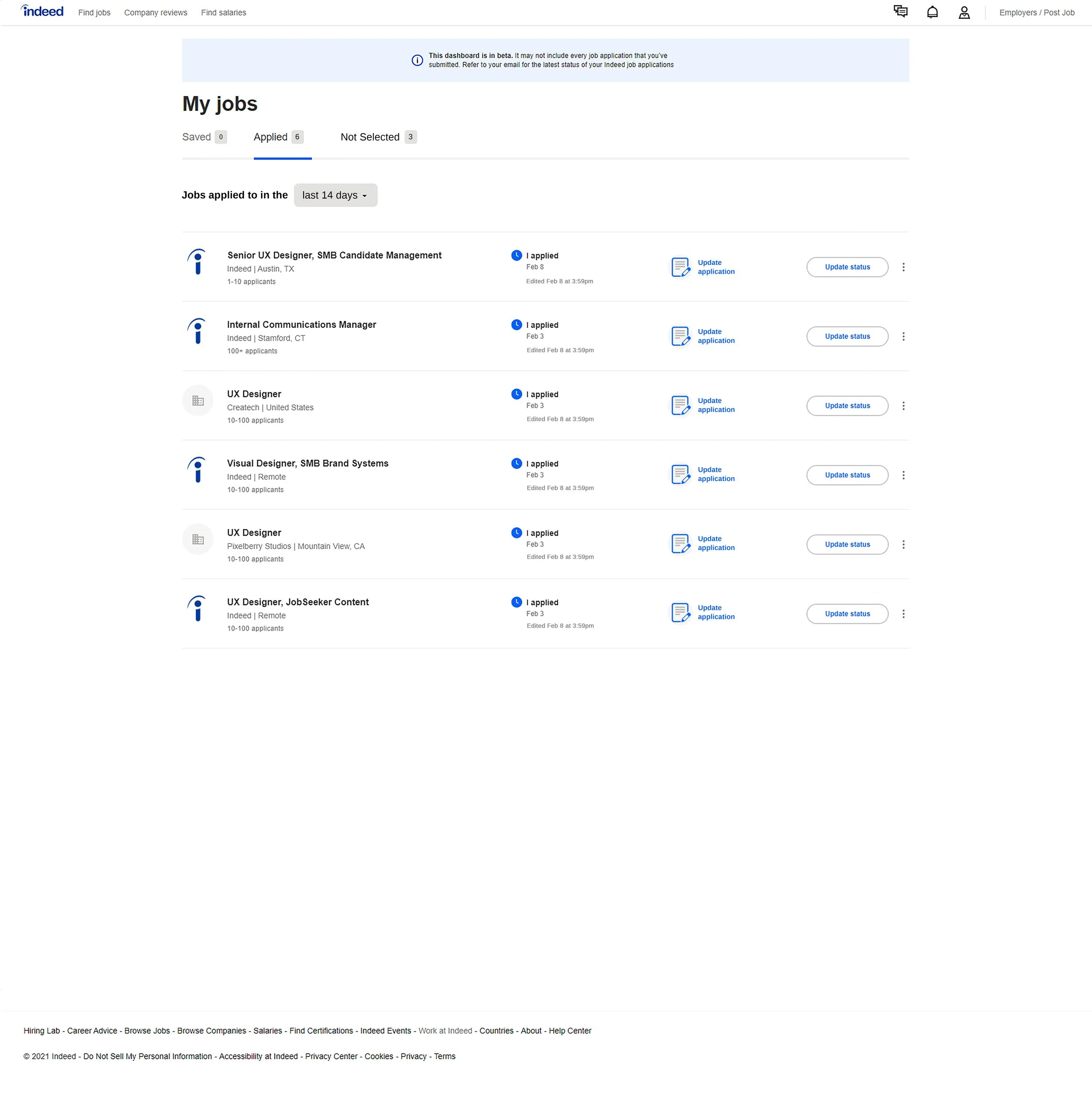
Date Selection Dropdown
A new dropdown would also allow users to see some or all of their open applications
Edited Timestamp
“Edited” timestamp would be added under “I applied” section, so the user can see time/date of edits
Update Status Realignment
“Update status” button would be realigned center within its row
Before & After

Before
After
Solution Testing & Iterations
All solutions could always be improved upon. By working with user researchers and performing user testing, we could pinpoint any weaknesses in the design and work to improve it.
Solution Testing
-
This iteration used a text label along with the icon, as suggested for best practices by Nielsen Norman Group https://www.nngroup.com/articles/icon-usability/
Other icons could be tested, along with text label verbiage changes; for example, trying “edit application,” or “change submission,” instead of “update application. “Update application” was used for clarity in this iteration
-
Can the user locate the feature with ease?
Another iteration may flip the location of the “update application” and “update status” buttons, having “status” before the “update application” button in each row.
-
These could be tested by sending out an email that simple confirms the submission changes, or another iteration could include both the original application, and updated application for the user to view
-
Could consider adding a component to the “update application” pop-up that shows how many times, if any, that the application has been viewed by the employer
Could also add how many times an application was viewed within the “My jobs” page itself by adding an extra column
-
Would have to speak with developers to see if this component is possible and if it could be integrated smoothly and effectively
Solution Iterations
-
Mobile version would have to test icon recognition as well
Created streamlined version without text label, however this would have to be investigated
Placement of “update application” icon may change depending on if text label is necessary
-
Note — this could cause a potential issue if some applications have more components than others; for example, supplemental questions which only apply to that particular position
-
This would encourage the user to keep applying, even though it could be a daunting process
-
ADA and WCAG compliance components — AI tools and accessibility interfaces like accessiBe could be integrated, or manually coding an accessibility feature directly into the page. These features should be available sitewide.
Overall accessibility of all new features should be tested extensively.
Full proposal slide deck